
As part of my quest to help indie authors, I'm often answering questions about formatting books. I also read a lot of books by local authors, who are mainly indies doing or paying for their own book setups. Too often, I can tell they did. That's not an insult. This self-publishing thing isn't easy and advice runs rampant, including advice that isn't always ... let's say: the acceptable way to do things. When I say acceptable, I mean what readers expect, and there are certain things they do expect. Yes, you can go rogue as an indie. I've done plenty of that myself. However, when it comes to formatting your book, you want to be sure it fits readers' expectations so they're focusing on your words, your story, and not the visual mishaps.
This post is aimed at print books, specifically for novels. Non-fic tends to follow a few different rules. Electronic books are completely different things and they must be formatted differently.
A note: I am not an industry publishing professional. I have, however, been doing everything, to include formatting, for my own books for a lot of years. I learned by studying big-pub prints and doing plenty of research, and sometimes by making mistakes with my own books. All rules can be debated, of course, but I’m a big believer in first knowing the rules before you decide which not to follow.
Let’s start with the cover.
1) Please, if you decide to design your own cover, do your research first. Look at books in libraries and bookstores or online (although many ebook covers differ than print covers, so be aware of that). First, do any of them state “by Author Name”? Only a few children’s books do that and it’s to differentiate between the author and the illustrator, since illustrations are as big a part of children’s picture books as the story. Even then, in most cases, the author is simply listed and the illustrator gets an “illustrated by” tag. If you don’t write picture books, do not put “by” in front of your name.
2) Be careful about throwing a photo on the cover and adding some text. Text font matters. Different fonts tell the readers different things. What would you expect from the following titles?

Play with effects and collages if you'd like, but be sure it doesn’t look like you grabbed a few stock photos and just threw them all together. Too often, I look at a cover and see "Photoshopped" instead of whatever the writer was trying to portray. Some readers won't mind; others will. Sticking a person in front of a scene without making sure the perspective is right and blending it well enough it looks like an actual photo screams amateur. On the other side of the coin, putting the title, an image, and your name all in center-alignment over a plain-colored background screams amateur (or vanity published). If your cover screams amateur, it won’t matter much how professional your writing may be. Look at the big pub books in your genre and try to follow their technique (without copyright violations, of course).
Note: If you want to save yourself a lot of heartache, you're not going to want to put a border around your book. Books are not always printed the same. There's the trim to consider and you can't know how much trimming there will be, exactly, so your border is very likely going to be bigger on one side than another. Just let your image run into the bleed area, keeping important elements far enough inside, and don't drive yourself crazy wondering how it will print.
3) The spine and back are part of the overall look with a print book. Don’t spend all of your focus on the front and then throw the rest together with some text over a plain color background. Make it a full picture, not necessarily one picture wrapping all the way around, but an entire work of art combined carefully to package your precious book.
Book Size
I was in a minor debate about this one recently. Currently, industry standard for fiction trade paperbacks run 5 x 8 or more technically 5.5 x 8.5 (that can depend on which printing/distributing company you use). You can go with 6 x 9 and I know some authors do this to try to keep page count lower (pages = $), but reader preference tends to be 5 x 8. You can go with a mini size, and I've experimented with short runs on that, to try to simulate commercial pocket books. They're cute and with smaller novels, that can work. Be aware, they will cost more to produce. From what I've seen at signings where I've had my 5 x 8 books displayed next to my mini size books (under my pen name), the smaller ones get less attention. Now, it could be different cover art, but I tend to think they are seen as of less value. Readers do look at norms. They do tend to want what they already expect, so your safe bet is 5 x 8.
Whichever you choose, make your books all the same size (under the same name, that is). Making the longer ones 6 x 9 to cut page numbers down and the shorter ones 5 x 8 to look longer only throws the reader. If some books are longer than others, readers should be able to see that. I've had a lot of browsing buyers flip through my books to see if they've been padded and received figurative thumbs up for their non-padded professional look. Just as readers who buy books in series want every book in the series to look related and relatively the same, those who see you have several books will prefer they all look congruous (should I say: professional).
The inside
1) Again, look at professionally printed novels. They all include a cover page, a copyright page, sometimes a second cover page with publisher info. Pay attention to whether these things are on the left or right side (odd or even pages) and do it the same.
2) Most novels do not have or need a table of contents. For ebooks, yes. Not for prints. Take that out unless you have a very long, complex story divided into sections other than only chapters. If you feel it is necessary, look at how it’s done in professionally formatted books. A long row of
1. chapter 1
2. chapter 2
3. chapter 3…
looks unprofessional, especially when it’s left-aligned like the text.
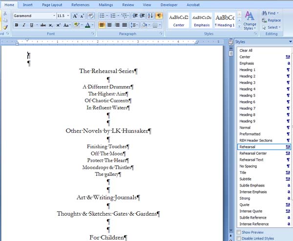
I am adding a TOC to the revised versions of my Rehearsal books because it is a series/serial of 6 books that run an average of 300K words and spans more than 10 years, with several subplots. I have each one divided into sections with separate headings, and so I'm providing a TOC to help readers navigate, in case they want to refer back to something in previous books. It looks like this:

3) Your front matter, everything before the first page of chapter one, should not have page numbers. Most novels don’t include the page number on page one of a chapter, either, but that’s at least acceptable. Your front matter doesn’t count as “pages” and should not pretend to count. Page 1 is page one of chapter 1. Sometimes they are given Roman numerals instead to differentiate, but that's unnecessary.
Different software handles this formatting issue differently. I use Word to write and format, which isn’t the easiest program to use for that, so I’ve heard, but I use section breaks to accomplish cutting out the page numbers in the front matter and not having page numbers on the first page of each chapter. It is a learning curve, but there are online tutorials to help you accomplish this.
4) Use serif fonts, not non-serif fonts. Please use serif fonts for novels. Why? It’s easier on the reader’s eyes and better for flow. What’s the difference? A serif is the little line at the end of a stroke. This blog is typed in a serif font called Georgia. See the little extra marks on the bottom of the letters? That creates flow. This, on the other hand, is Arial, the most common non-serif font. It looks far more staccato (sharp and detached). Cambria is a common printed book text. So is Garamond, and it might be the most used among professional self-publishers. Georgia works, also. You can use Times New Roman, but I would stick with something prettier and less all-purpose for print books. It works well for e-books, though. If you use a non-serif font, use it purposely for effect, but be aware it might be a bit off-putting to your reader. Novels should flow.
Keep your font relatively small, also (unless you are creating a large print edition or a picture book) without making it too small. Print a page and compare it to a professionally formatted novel. Slight differences are fine. Big fonts look unprofessional, as though you're trying to pad the book length to make it look more substantial. Even that little difference in fonts makes a difference in overall reading experience, and print book readers are all about the experience!
5) Do not double space. Double spacing is for submissions and term papers, not for print novels. Use your word processor to add some extra space between your lines. Multiple at 1.1 is a nice professional look and easy on the readers' eyes.

Also, do not leave extra wide margins, since that gives the same impression. There are plenty of resources online to help determine how big your margins should be. For my 5.5 x 8.5 books, I have the top margin at .6 to allow space for my header that includes the page number, and the rest are at .4 with a .25 gutter with mirror margins so the gutter stays on the correct side.
6) Paragraphs should not be double spaced, either. Keep it the same as the rest of the text and indent. This is different than for eBooks where it’s common practice to double space between paragraphs. That’s fine, although there is some debate about that practice, as well, and it has flowed over somewhat into print books to leave space between paragraphs rather than indenting, but look at big pub books. How many are doing so? Again, readers expect flowing text, not a bunch of extra space.
7) Do not add two spaces after periods. Just don't. In the "old days" when we were using typewriters, it was necessary. With computer processors, it only adds extra white space and makes you look like you're not up-to-date on technology and formatting rules.
8) Left-align or justify? This can go either way. It’s becoming more acceptable to left-align books. If you do this, you’ll want to use hyphens so you don’t have huge gaps at the ends of lines, but you want to hyphenate sparsely. Your word processor should give you the choice. Most of my books are justified (which could make a good joke), but for my very long Rehearsal books, I decided to left-align instead because I wanted that extra flow. After printing the first one I did myself (book 3, since the 1st two were formatted and printed through a company I’m no longer using), I noticed too many gaps at the end because of no hyphenation. I don’t like every other sentence to hyphenate, so I took them out, but that was too extreme. I’ll be reformatting that book to include adding sparse hyphens. (You live and you learn!)
9) Header info: Your name goes on the top of even pages and your book title goes on the top of odd pages. Page numbers can go on the outside corner of the top or bottom or centered on the bottom. I put it all together on the top with page numbers on the outside corners and my name and book title centered. It takes less playing with the formatting (no bothering with a footer) and keeps all non story text in one place mostly out of the way. Make this text a different font from your story font, generally smaller is better, for better clarity/separation, and be sure your header is large enough this info is not too close to the regular text.)
10) At the end of your book, start with your acknowledgements and then a bibliography if needed (most novels do not need a bibliography). At the very end, add your About The Author info. Use third person, not first, and keep it brief. You can add your whole life story to your website if you wish, but this is not the place for that. You might want to start each end section (acknowledgements, bibliography, about the author) on an odd page. This is very flexible rule, more like a suggestion, really. Under your Author info, include your website if you have a permanent website link. Do not add links to social media, specific book sites, etc., as these can change, and a few years down the road, your info will be outdated. [If you don't have a website, get one. Honestly. Make it YourName.com, since your author name is your biggest author brand, and gather all of your books under that site. Some authors do make separate sites for separate books/series, but I think that's a huge waste of time/money, unless of course you only plan to put out that one book, then by all means, create a MyBook.com website.]
In the End...
This is your book. If you have specific reasons for going against the standard practice, it's your right to do so. Be careful, though. You need to balance artist creativity with reader expectations and know that going too far out of the lines will push some readers away.
I may be forgetting a few things. Do you have any tips or annoyances to share related to formatting? If it’s something of which I’m guilty, I’d rather know than to blindly keep doing it wrong or annoying the reader. I may annoy them now and then with a character’s opinions or actions, but that’s just part of the job. ;-)
This blog post is ©LK Hunsaker. Share only by linking to this post. You can copy and share a very brief bit of info from the text if you include the link with it.
